- CSS Box Shadow Card Effect
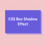 Lorem ipsum dolor sit amet. Consectetur adipiscing elit sed do. Tempor incididunt ut labore et dolore. Magna aliqua ut enim ad minim veniam. Quis nostrud exercitation ullamco laboris. Creating a 3D card with pure CSS CSS box-shadow is a powerful… Read more: CSS Box Shadow Card Effect
 - CSS Glowing Button with box-shadow
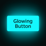 Glowing Button Creating a glowing button with CSS is an easy way to add life to your UI. Using only box-shadow and the :hover selector, you can create an effect that reacts smoothly to user interaction. Let’s build a neon-style… Read more: CSS Glowing Button with box-shadow
 - CSS Neon Loader Animation with box-shadow
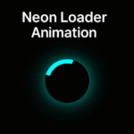 Creating a glowing loader with CSS is simple yet visually striking. In this tutorial, we’ll build a neon-style loading spinner using only CSS properties like border, box-shadow, and @keyframes. The result is a smooth, futuristic loader that fits perfectly into… Read more: CSS Neon Loader Animation with box-shadow
 - CSS Glowing Orbit Animation with box-shadow
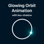 Creating glowing animations with CSS is simpler than it looks. In this short guide, we’ll build a glowing orbit effect using pure CSS. We’ll use just a few properties – box-shadow, border-radius, and @keyframes. No JavaScript, no libraries. HTML CSS… Read more: CSS Glowing Orbit Animation with box-shadow
 - CSS Counter Animation – A Fun Way to Create Dynamic Number Effects
 CSS gives us some surprisingly powerful tools that can replace JavaScript in simple interactions. One of those tools is the CSS counter. With just a few lines of code, you can create an animated countdown or progress effect using only… Read more: CSS Counter Animation – A Fun Way to Create Dynamic Number Effects
 - CSS Text Gradient Effect
 CSS Text Gradient Adding a gradient to your text is a small but powerful design touch that can completely transform the look of your website. The CSS text gradient effect makes your titles, headlines, and call-to-actions pop out beautifully without… Read more: CSS Text Gradient Effect
 - CSS Ellipsis – how to handle text overflow
 Ever had that moment when your text just blows up the layout because it’s too long? You open the page, and suddenly a username or title stretches across the screen like it owns the place. That’s where CSS ellipsis comes… Read more: CSS Ellipsis – how to handle text overflow
 - Neon Orbit Button in CSS – Create a Smooth Animated Border Effect

- Password Toggle in HTML – Show or Hide Password Easily
 Sometimes users want to check what they typed in a password field. Adding a show or hide password feature is one of the simplest and most useful touches you can make in a form. The best part is that you… Read more: Password Toggle in HTML – Show or Hide Password Easily
 - Responsive Layout with Flexbox – Step by Step CSS Tutorial
 1 2 3 Building a responsive layout is one of the most common tasks in web development. Flexbox makes it much easier than traditional float-based layouts. Let’s go step by step and see how each CSS property changes the layout… Read more: Responsive Layout with Flexbox – Step by Step CSS Tutorial
 - CSS Border Radius – How to Create Perfect Rounded Elements
 Rounded corners make interfaces look smoother and friendlier. The border-radius property in CSS lets you create this effect easily. It is one of the simplest yet most useful properties for UI designers and developers. Basic Usage The easiest way to… Read more: CSS Border Radius – How to Create Perfect Rounded Elements
 - CSS Typing Effect – Create a Typewriter Animation with Pure CSS
 Follow for more stuff The typing effect simulates a typewriter. Characters appear one by one while a caret blinks at the end. You can build it with pure CSS using width animation and a border based cursor. What we are… Read more: CSS Typing Effect – Create a Typewriter Animation with Pure CSS
 - Create a Frosted Glass Effect with Pure CSS
 If you have ever admired the soft, glassy panels on macOS or iOS interfaces, you have seen the frosted glass effect in action. It adds depth, elegance, and a premium feel to modern web designs. The good news is that… Read more: Create a Frosted Glass Effect with Pure CSS
 - Create an Icon Pulse Animation with Pure CSS
 A small animation can bring life to your interface. One of the simplest but most effective effects is a pulse animation. It’s perfect for notification icons, alert buttons, or anything that needs to attract gentle attention. With only a few… Read more: Create an Icon Pulse Animation with Pure CSS
 - Create an Animated Checkbox Using Pure CSS
 Checkboxes are one of the simplest form elements, but they do not have to look boring. The default browser style often feels outdated and inconsistent between different operating systems. By using CSS, you can completely redesign them and even add… Read more: Create an Animated Checkbox Using Pure CSS
 - Create an Animated Input Field with Floating Label Using CSS
 Username Forms are one of the most important parts of any website. They collect data, handle communication, and connect users with your product. But in most cases, input fields look boring and outdated. A few small details can completely change… Read more: Create an Animated Input Field with Floating Label Using CSS
 - Create a Glitch Text Effect with Pure CSS
 Cool Glitch Text The glitch effect is a fun way to give your text a digital, futuristic feel. You’ve probably seen it in game titles, tech blogs, or sci-fi websites. It looks like a complex animation, but you can actually… Read more: Create a Glitch Text Effect with Pure CSS
 - How to Use CSS :placeholder-shown for Interactive Inputs
 Go There are many ways to make form fields more interactive. Most developers jump straight to JavaScript, but CSS can already handle some surprisingly dynamic behaviors. One of the lesser-known gems is the css :placeholder-shown pseudo-class. It lets you detect… Read more: How to Use CSS :placeholder-shown for Interactive Inputs
 - Create a Gradient Border Animation with CSS Custom Properties
 Animated borders are everywhere in modern UI design. They make simple elements look alive and dynamic. The best part? You can do it with pure CSS. The Problem A static border looks fine, but it doesn’t grab attention. Designers often… Read more: Create a Gradient Border Animation with CSS Custom Properties
 - How to Change Placeholder Color in CSS
 Introduction Placeholders often look dull and gray. They don’t match your website’s design and feel out of place. Luckily, CSS gives you an easy way to fix that. The Problem By default, most browsers use a light gray color for… Read more: How to Change Placeholder Color in CSS
 - Truncate text with Ellipsis
 A very Long Text! Learn how to make long text look clean with a simple CSS trick. This article shows how to use text-overflow: ellipsis to keep your layout neat and professional. Sometimes long text looks bad in a layout.… Read more: Truncate text with Ellipsis